Honolulu Restaurant Reservation App
UX/UI Design
Project Overview
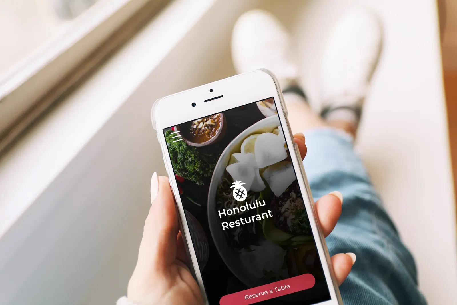
Honolulu Restaurant is an award winning restaurant, located on Ala Moana Beach. This restaurant thrives on family events and hosting festivals. Honolulu Restaurant caters to many different people. From families who want to enjoy a luau on the beach, to the women who want to enjoy a wine festival for ladies night out, or even to the couple who want to enjoy a nice dinner.
The Problem
Customers have a hard time reserving seats for events, festivals, and dinners.
The goal
Design an app so the customer can make a reservation for any special event (including festivals) and dining.
Project Details
Date:
2022
Client:
Personal Project
Services:
UX/ UI Design
My Contributions
UX Designer designing app for Honolulu Restaurant Reservation App from conception to delivery. Conducting interviews, paper and digital wireframing, low and high-fidelity prototyping, conducting usability studies, accounting for accessibility, and iterating on designs.
Platforms
Figma
User Research:
Summary
May 2022
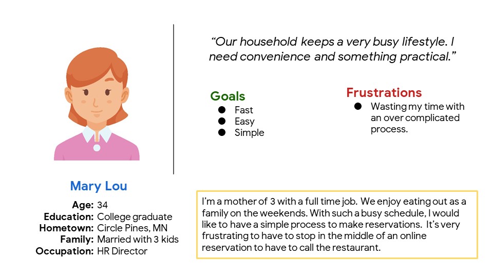
I conducted interview and created empathy maps to better understand the users I'm creating the app for. I found 1 primary users through my research. Busy working adults who need a fun family night.This user group confirmed my assumptions about busy working parents, but research also showed that time wasn’t the main factor. Busy working parent also feel the guilty of not having family time often. Other obligations and problems interfere which make it difficult for busy families.
Persona 1: Mary Lou
Problem Statement:
Mary Lou is a HR Director who needs a fast way to reserve a family dinner because they live a busy lifestyle and need family time.
User Journey Map
Problem Statement:
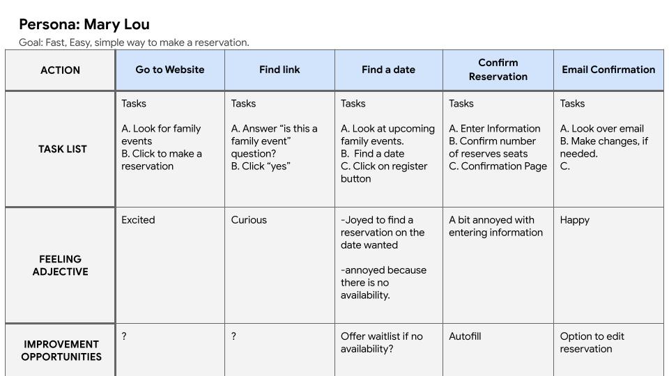
Mary Lou’s user journey showed how helpful it would be for users to be able to see all the events and information ahead of time. Also making things even easier with autofill for a faster experience.
Digital Wireframes
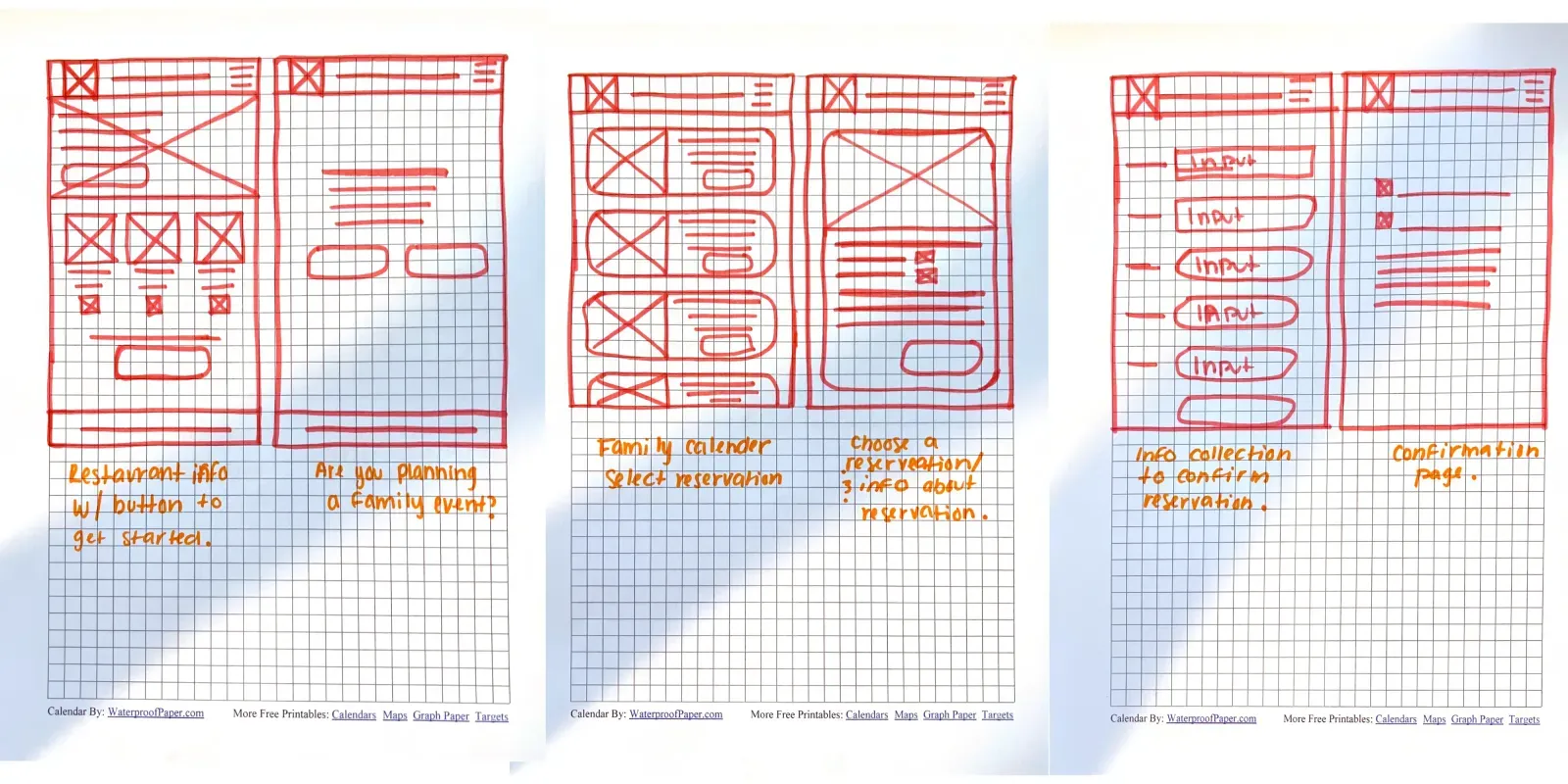
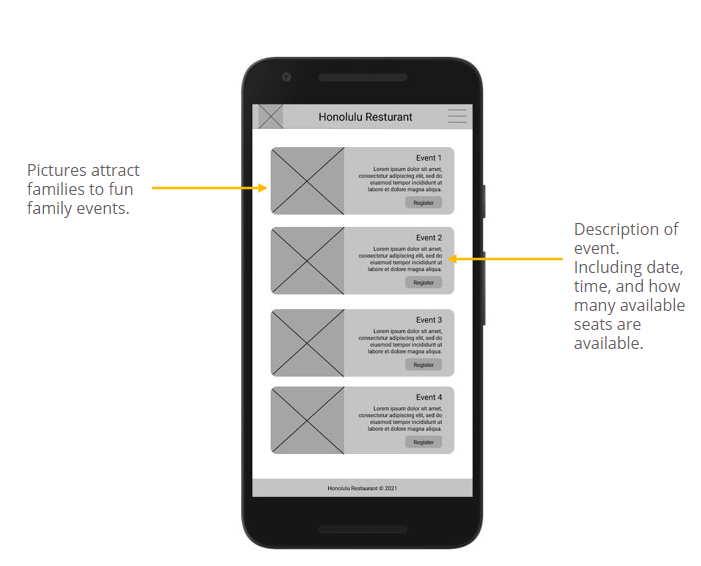
As I continued designing, I made sure to design things simple but also including important information.
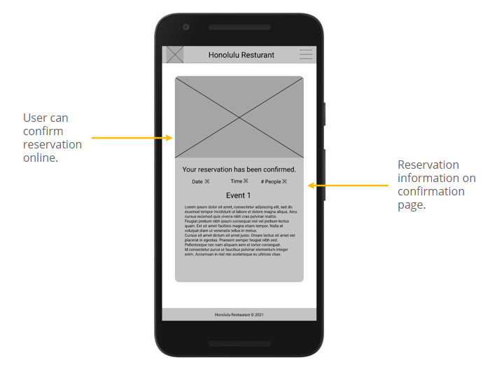
User should be able to confirm their reservation with no need to call the restaurant.
Low-Fidelity Prototype
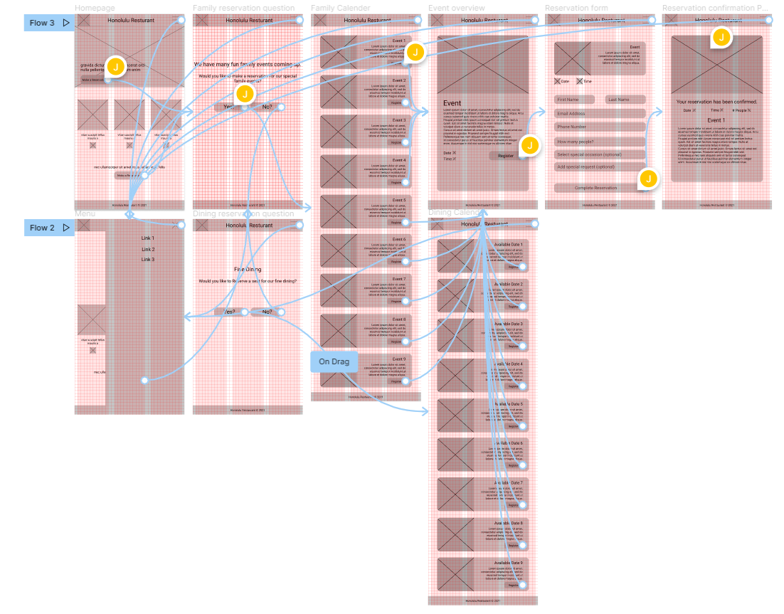
The low-fidelity prototype connected the primary user flow of picking a date and making a reservation, so the protype could be used in a usability study with users.View the Honolulu Restaurant Reservation App
Usability Study: Findings
I conducted a usability study on 3 different people. Recorded their actions and created and affinity map. After, I was able to find common themes.
Round 1 Findings
1. Users need a clear icon to represent a date.
2. Info wasn’t present so users need a better cue.
3. Users assumed confirmation; users need a clear explanation.
Round 2 Findings
1. Users needed a better way to make a reservation for dining vs events.
2. Users felt stuck or the process felt incomplete when making it to the confirmation page.
3. Some styles didnt pop out so easy for the users or were hard to get to.
Mockups
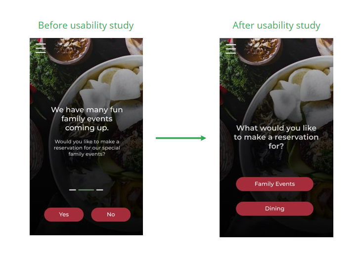
Earlier in the design process, we asked the clients yes or no questions. Which lead to another screen. This lead to confusion. I revised the design by consolidating the two screens and clarified the question and process.
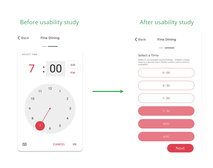
Earlier in the design, we allowed customers to select their reservation time. I revised the design allowing customers to see times that are no longer available.
High-Fidelity Prototype
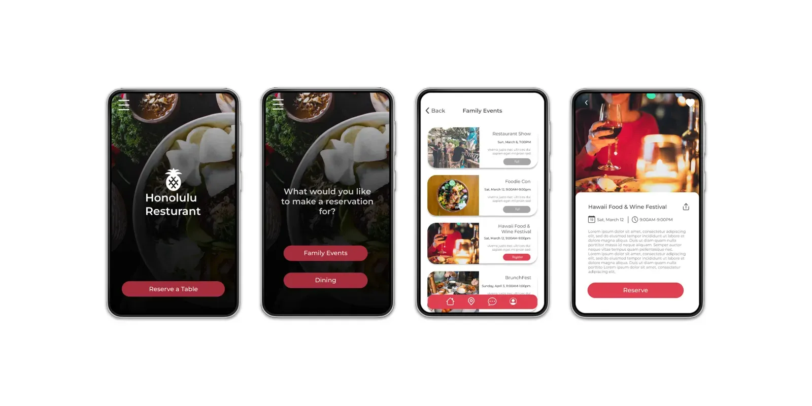
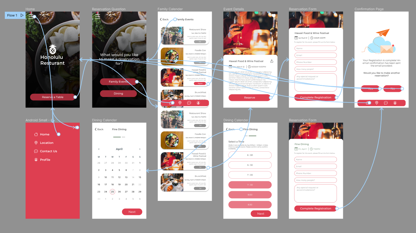
The high-fidelity prototype followed the same user flow as the low-fidelity prototype, including design changes made after the usability study. View the
Accessibility Considerations
1.We tried to use contrasting colors. Also attempting to be careful with over usage of colors.
2. We considered the interactions in the prototype and made sure they were no more than 5 seconds.
3. We also made a menu to be able to help navigate in other ways.
Next Steps
1. Conduct another usability study to see if there are any other pain points.
2. Conduct more research for better user experience.
Takeaways
Impact:
This app will allow customers to make easy reservations for Honolulu Restaurant.
What I learned:
I learned that people think differently than I do. The first design was only the beginning of my thought process but with usability study and feedback. I was able to discover more design influence.
Want to work together?
If you like what you see and want to work together, get in touch!
info@jvtdesignstudios.com